Cramming 'Papers, Please' Onto Phones
Aug 06, 2022
I created Papers, Please in 2013 specifically for desktop computers with mouse control. Now, here, in 2022, desktop computers no longer exist and all computing is done via handheld mobile telephone. Time to update this dinosaur.
These thousands of words and megabytes of images will cover some bits of porting the game from big desktop to little phone. As a winking throwback to days past, this is a big dump of text and inline img tags instead of exciting splashes of quick-cut video. In 9 years, I’ll port this post to VR.
Beyond the minimal amount necessary to make the interface work, there are no content changes or additions for this port. No wild story twists, no new characters, no voiced dialog, no stereoscopic ray-traced graphics, and most disappointingly, no cosmetic unlockables.
Same meal, different plate.
Step 1: To Unity
Papers, Please was originally written in Haxe/OpenFL, a combo of modern ECMA-ish language, Flash-alike API, and multi-platform build system. This was a great environment for getting the game together quickly in 2013 but over the years Haxe has moved away from its Flash-targeting roots, and keeping up with OpenFL changes to make game updates has required outsized effort.
When I finally committed to this port my first decision was to rewrite the game in C#/Unity. After Obra Dinn I’m a solid fan of Unity – the editor, the entity/component design, the build system, the ubiquity, just about everything.
I made it a few days into rewriting before finding that although I like C#, I like Haxe more. In making the game I’d leveraged a bunch of core Haxe features like super enums and implicit typing and it was all getting trickier and trickier to implement by hand in C#.
One option would’ve been to keep the Haxe part but switch from OpenFL to Heaps, another Haxe-based engine and build system. Dead Cells, Northgard, and a few other games are built with Haxe/Heaps so it’s a perfectly capable system. Still it’s hard to overstate how appropriate Unity is for someone in my position: a solo developer targeting multiple platforms and desperate for a popular, proven, and well-supported engine and build system.
Fortunately, Haxe is a transpiled language, meaning that you write in one language (Haxe) and it gets converted to another language (Javascript, PHP, Python, C++, C#, Lua, etc) before being compiled/interpreted for whatever target you’ve got. So it’s possible to write code in Haxe and have it transpiled to C# that can be loaded and compiled in Unity. Which is how I decided to roll this.

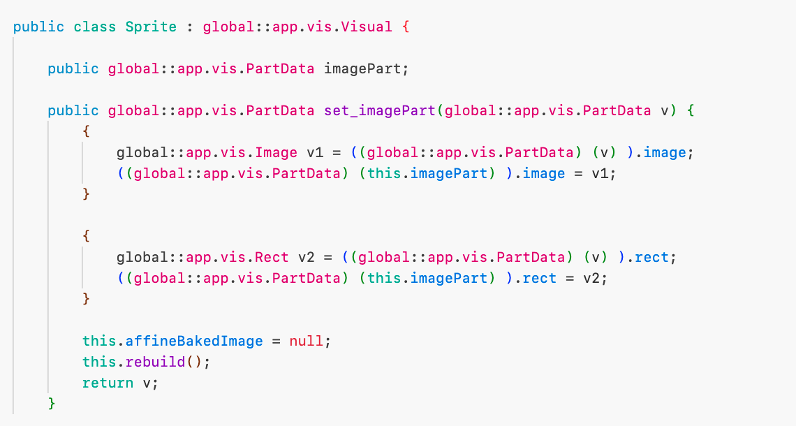
First, I stripped all usage of the Flash-like API that OpenFL was providing. The display tree, input events, bitmap manipulation, resource management, sound playback – basically everything that wasn’t core game logic. Then I rebuilt it all with custom code, the goal being to create a sort of PAPERS-PLEASE black box that could take user input and spit out a list of quads to draw and audio commands to execute every frame.
This was probably the most fun part of the project. The full Flash API was overkill for Papers Please anyways, and building a fresh engine specifically for what I needed was cathartic.
I was slightly worried about performance here, since much of the OpenFL API is written in C++ and I was replacing it all with higher-level Haxe code. The requirements for the game are earth-core low though, and Haxe is pretty performant anyways so I only had to be a little bit careful to get good framerates.
The end result requires a minimal host shell to send input to the black box and render the quads and audio commands that it outputs every frame. This minimalism meant it was manageable for me to create two hosts: one in Heaps and one in Unity.
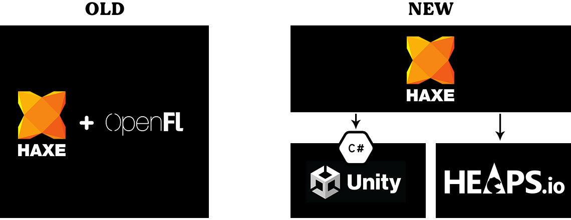
Haxe itself compiles almost instantly and is well-supported in Visual Studio Code so writing and debugging in Haxe/Heaps is quick and easy. For making releases, I transpile to C#, tab over to Unity, and build the project there.
Step 2: Phoneterface
Maintenance aside, the main thing holding me back from getting this game onto phones was its user interface. Papers, Please was always meant to be played on a large device. The actual resolution is laughably low (570x320) but these pixels need to be big.
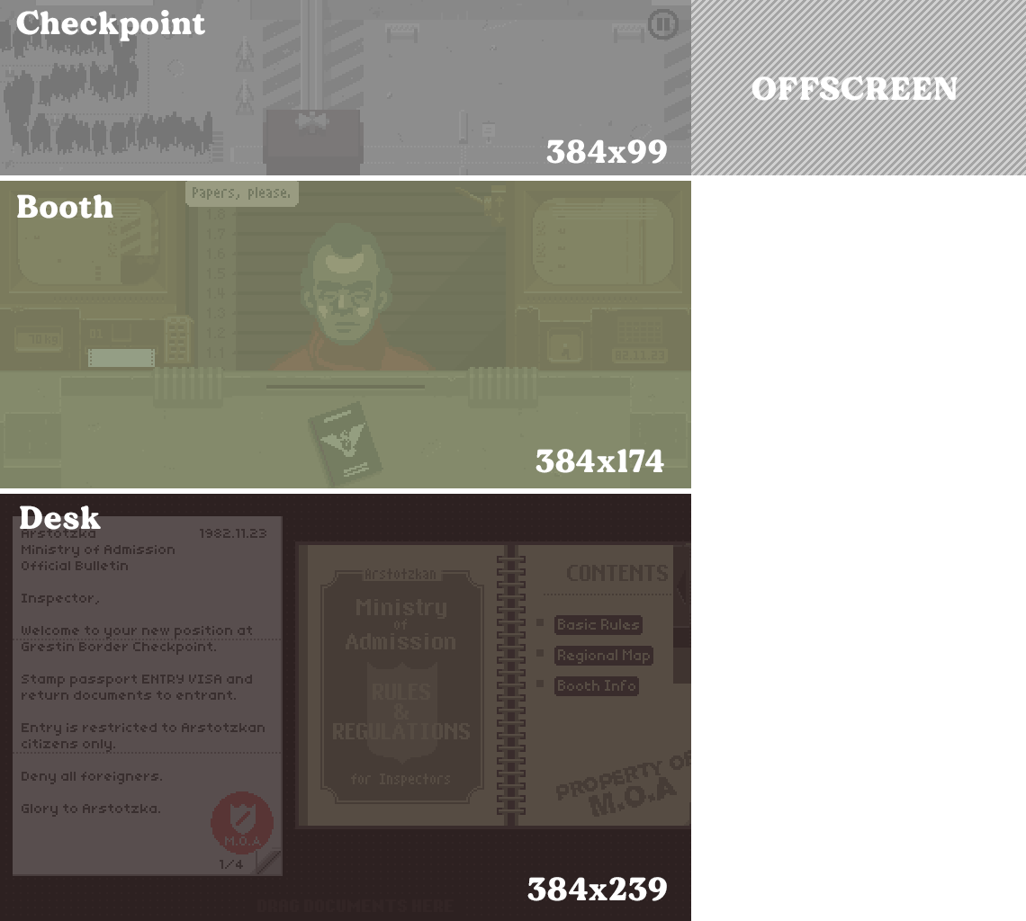
The screen is divided into three always-visible regions:
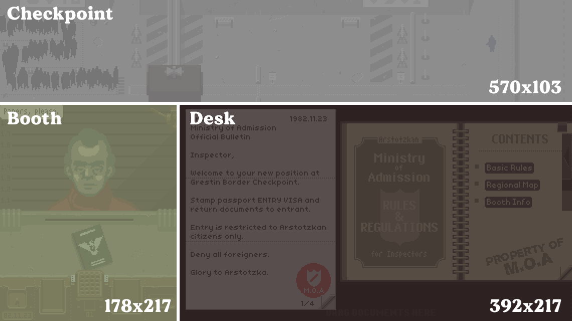
Back in 2014, I separated out a chunk of interface layout code from the core logic in order to create an iPad version of the game. With a few adjustments I was able to preserve the “three regions” layout and drag-n-drop gameplay. The biggest changes are that the regions are stacked vertically with slight dynamic sizing ability, and the checkpoint area shows a horizontally scrollable window instead of the whole thing at once.
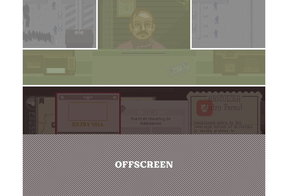
James Gray built on this to create the Vita version, which needed even more layout changes but kept all the same gameplay. The small screen required overlapping the checkpoint area with the booth and fullscreen vertical scrolling but the Vita’s combination of physical and touch controls offset these compromises pretty well.
For phones I wanted something that felt natural to the device, which meant a few subjective things:
- Played in portrait mode.
- All three regions visible at all times.
- No squinting, zooming, or precision required to read/manipulate documents.
Starting with the iPad layout and throwing together a quick mockup using the latest iPhone screen aspect:
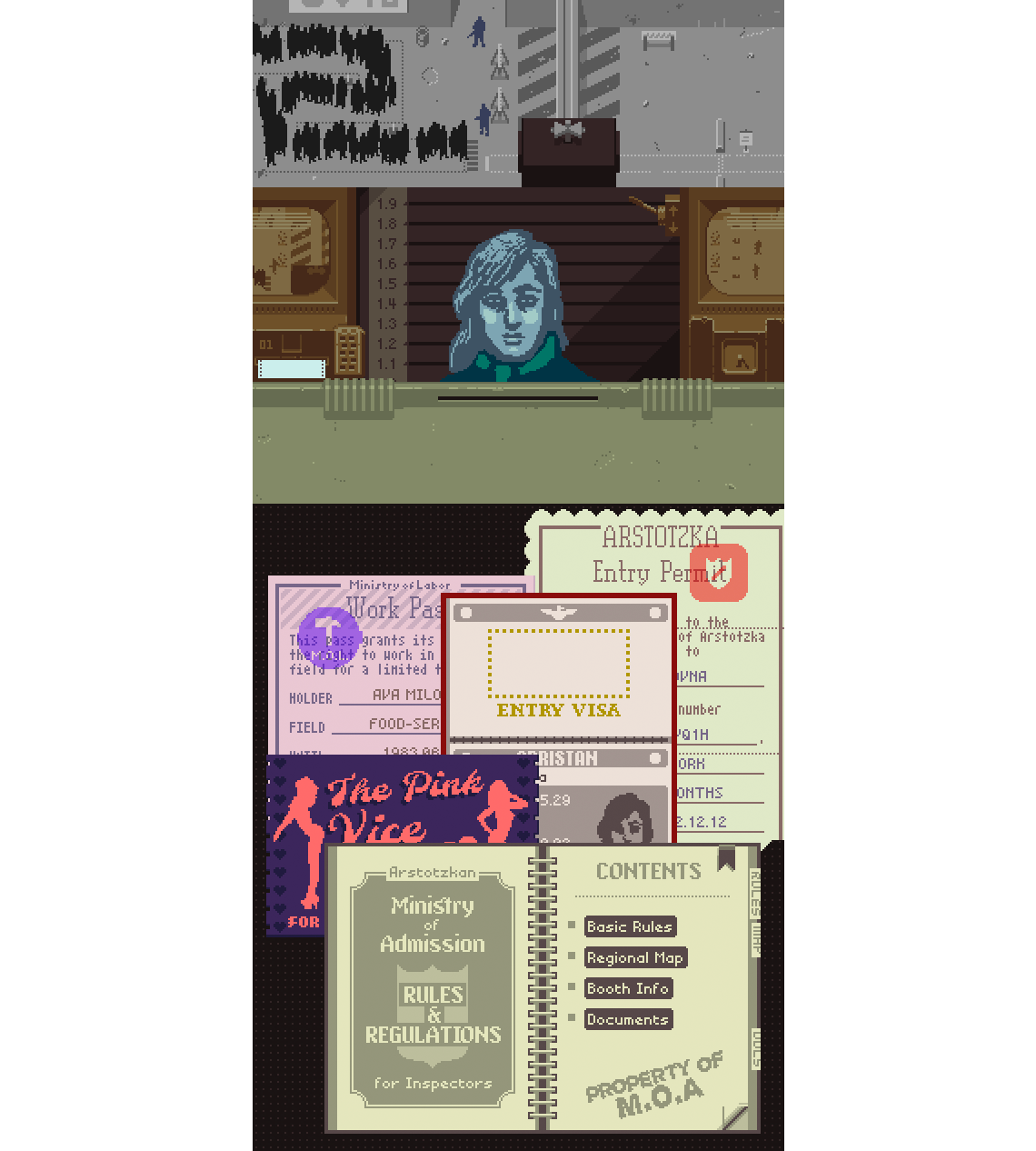
I tried a few permutations of this, all alike. Converting 16:9 content to 10:22 involves a special kind of desperation. One variation that I didn’t hate had the face a bit bigger:
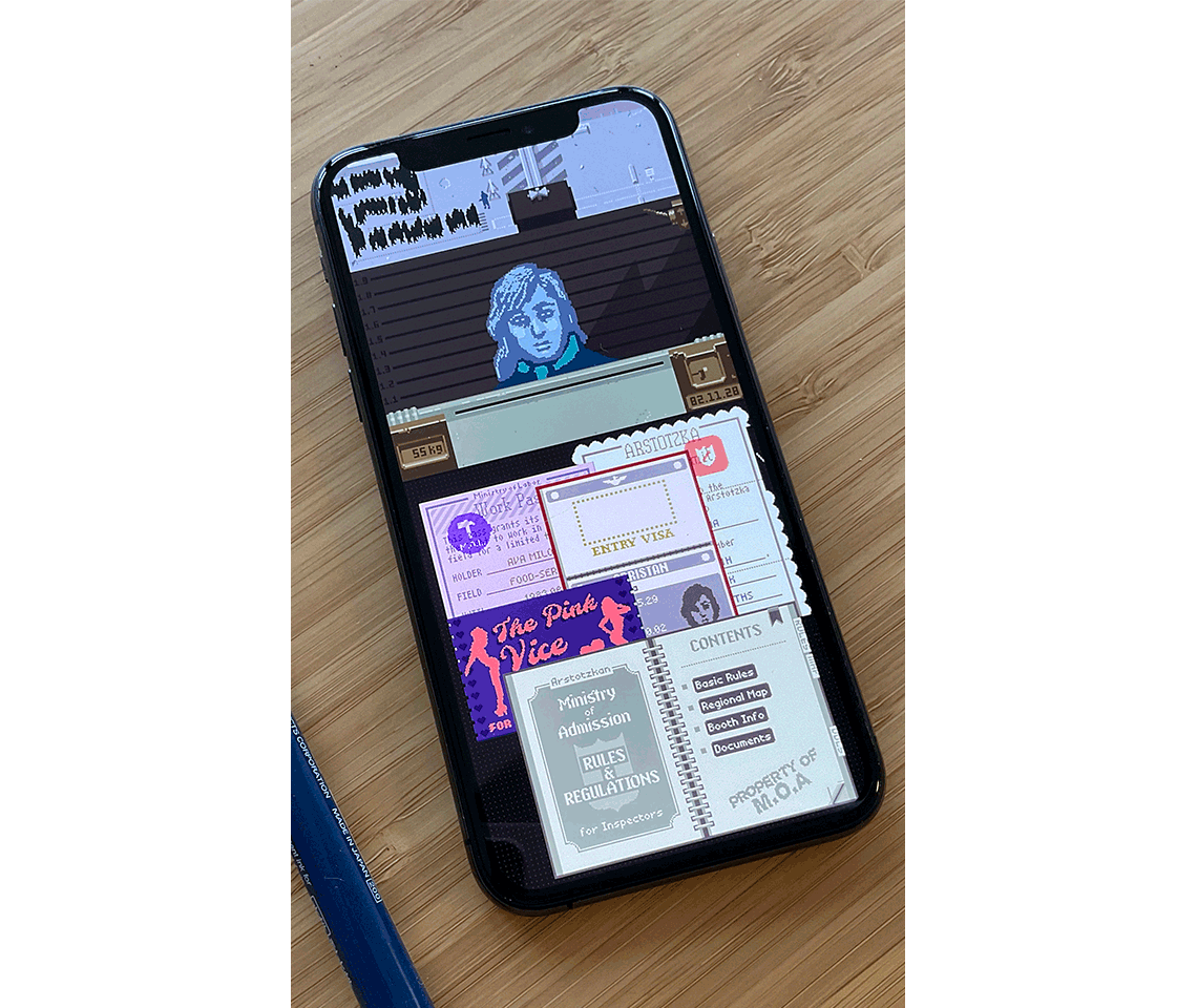
Some conclusions after churning through a bunch of mockups:
- The border checkpoint view at the top will have to scroll left/right even more than the iPad version. Thankfully, the important stuff still fits without scrolling.
- The documents are too small and the desk area too crowded. There’s a fundamental conflict between readability and having enough space for arranging things.
- Love that big face.
The jumbo face felt so nice that I concluded the documents should also be big, and that uncorked the brew that defines this port: no more desk, no more drag-n-drop. I swung all the way to readability and eliminated the arrangeability requirements completely:
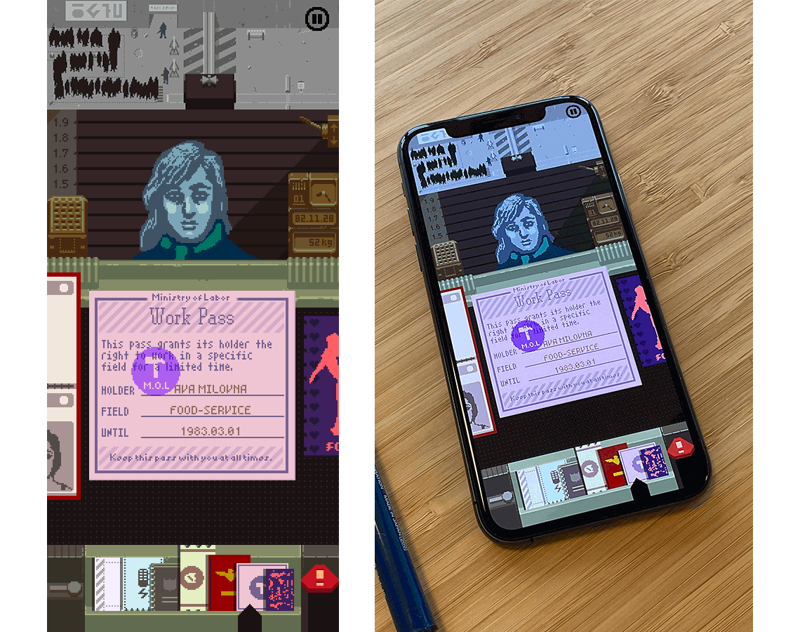
The desk where documents were manipulated has been replaced by two separate elements: a carousel for closeup work and a rack for quick navigation.
The Carousel and the Rack
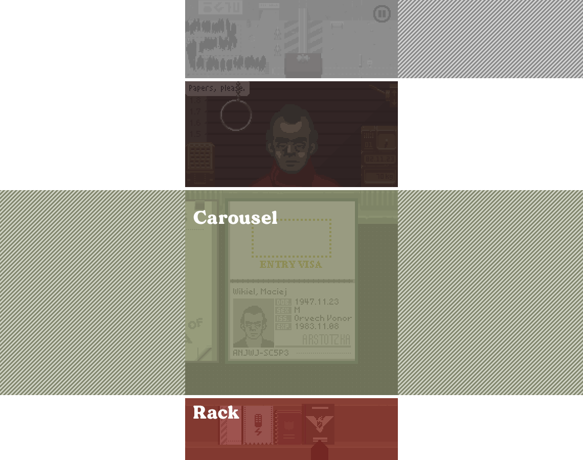
With the carousel, documents are displayed full-size in a long, horizontal, snap-scrolling list. The rack at the bottom shows a representation of all documents in smaller form. Navigation is done either by swiping the documents directly, or tapping/dragging anywhere in the rack.
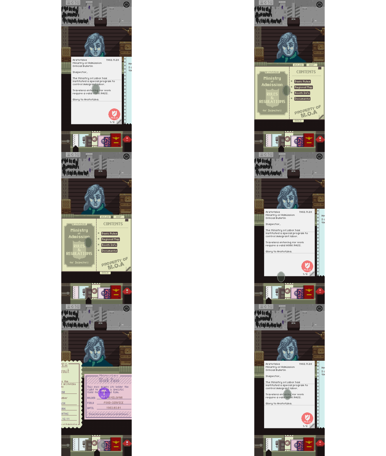
My first worry when considering this interface was that it changed the gameplay too much. Instead of organizing documents on a 2D surface, you’re just swiping around and viewing each document in near-isolation. The banner task from the desktop game is totally missing now.
That’s a good clue to turn back but I knew this port would require some blood. After testing my first basic carousel implementation, the arterial spray I expected from losing document management turned out to be more of a minor abrasion.
In the end, I’m happy with the trade-offs. Swiping feels natural on the phone, and dealing with document inspection has its own rhythm – different from the desktop version but still fun. Instead of arranging the documents and darting your eyes around to correlate information, you manipulate the documents as a group and eye-dart a little less.
This carousel + rack represents the big sea-change adaptation for the phone port, and it had ripple effects throughout every single other element of the game’s main interface. I’ll go through the more interesting of these changes in exhausting animated-gif-supplemented detail below.
But first a word about the pixel grid.
The Pixel Grid
In working on a pixel-art game, one decision every developer has to make is how honest they’ll be about their pixel grid. There’s usually no actual restriction that all your pixels need to be the same size and even Nintendo’s Mario Maker series aerial kicks pixel size consistency directly in the face.
Resolution-wise, the phone interface settled into 208x405 based on how the game’s existing documents would fit legibly onto a modern non-Max iPhone. Not a lot of pixels quite frankly, and man that checkpoint region at the top is bulky.
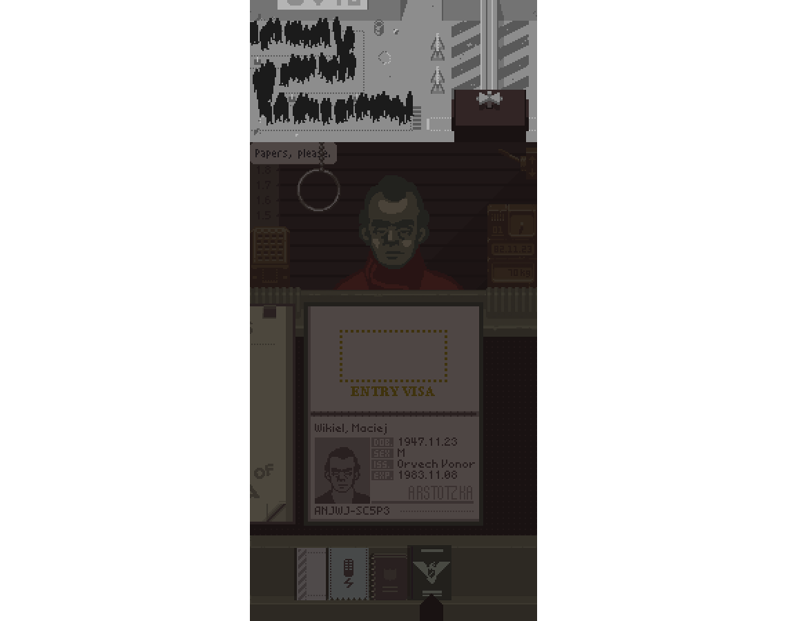
I definitely prefer maintaining a single consistent pixel grid but we’ve all got our price. In this case, cheating to two pixel grids solved a lot of problems. With a base scale of 3x, the main booth and document regions can run at 3x while the checkpoint is a more manageable 2x.
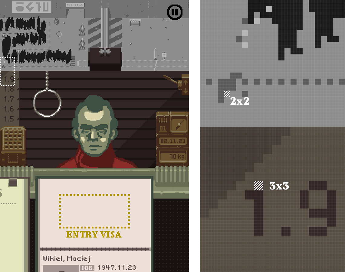
In code, this is handled with fractional 2/3 pixel scaling on the 2x stuff, which multiplies out to integer coordinates in the final 3x buffer.
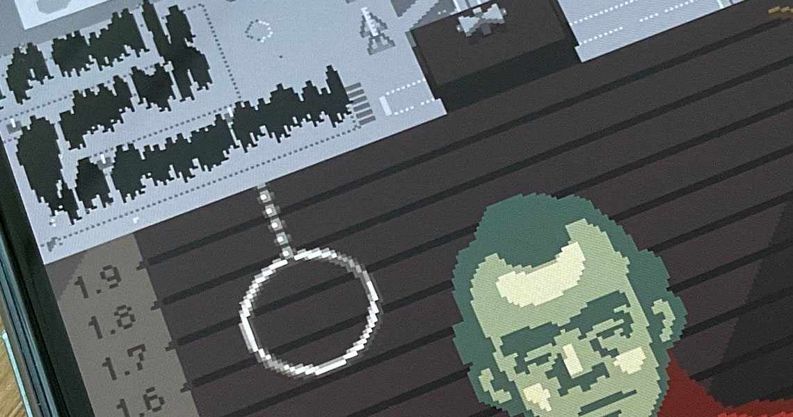
With the pixel grid sorted there’s still the problem of scaling the whole image onto a phone screen. Thankfully the effective resolution of the game is basically only 208x450 and phone screens – especially retina ones – are delirious with pixels. A combination of integer scaling and bilinear filtering doesn’t hurt so bad here. The phone version handles aspect adjustments within a certain range and then scales the result to fill the device’s screen.
On to some specifics of how the core interface changes played out.
Too Narrow, Doesn’t Fit
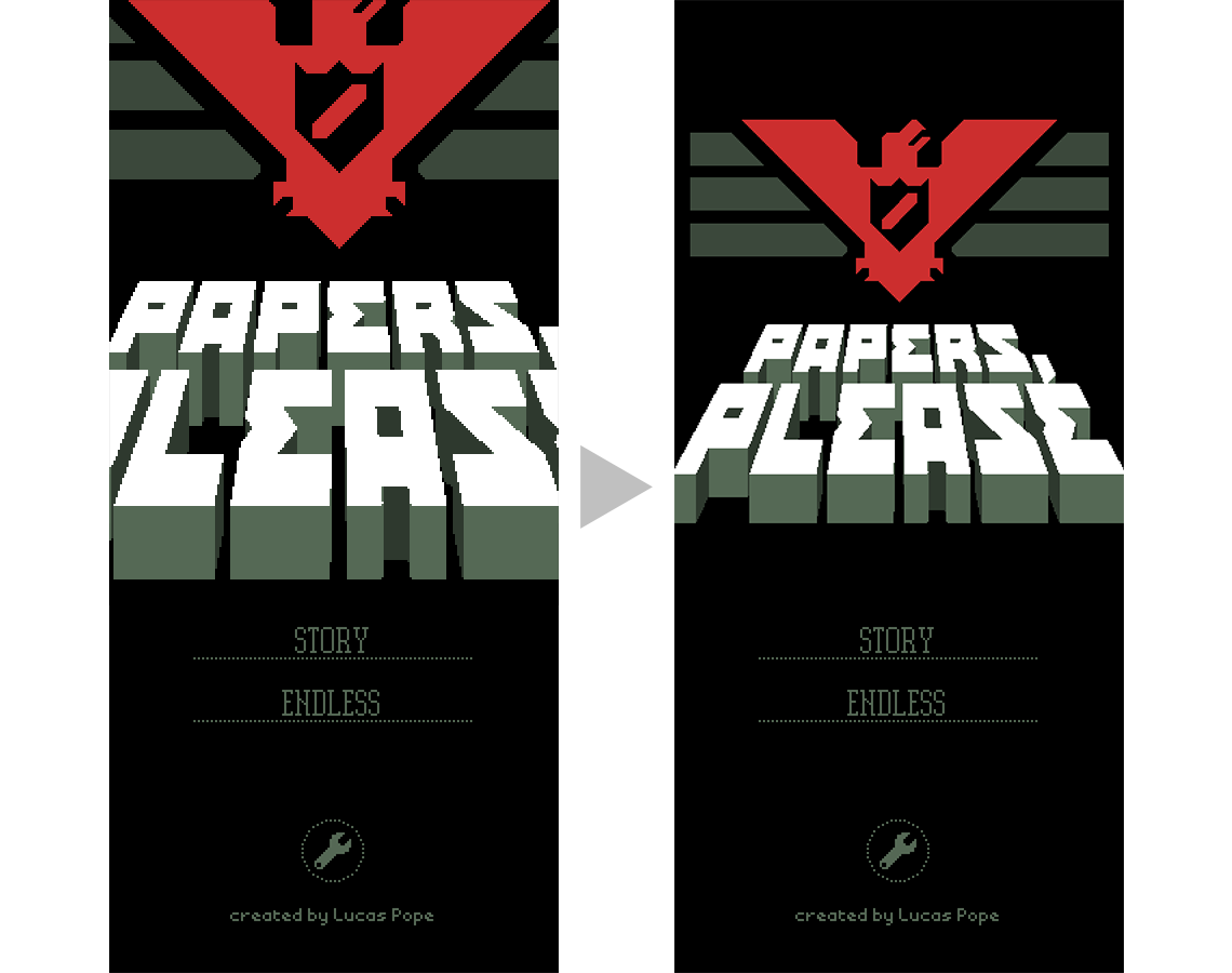
Several of the game’s single visual elements don’t fit in the base 208 pixel width. Instead of redrawing them, the extra 2/3 scale option made some fixes easy, as with the title screen:
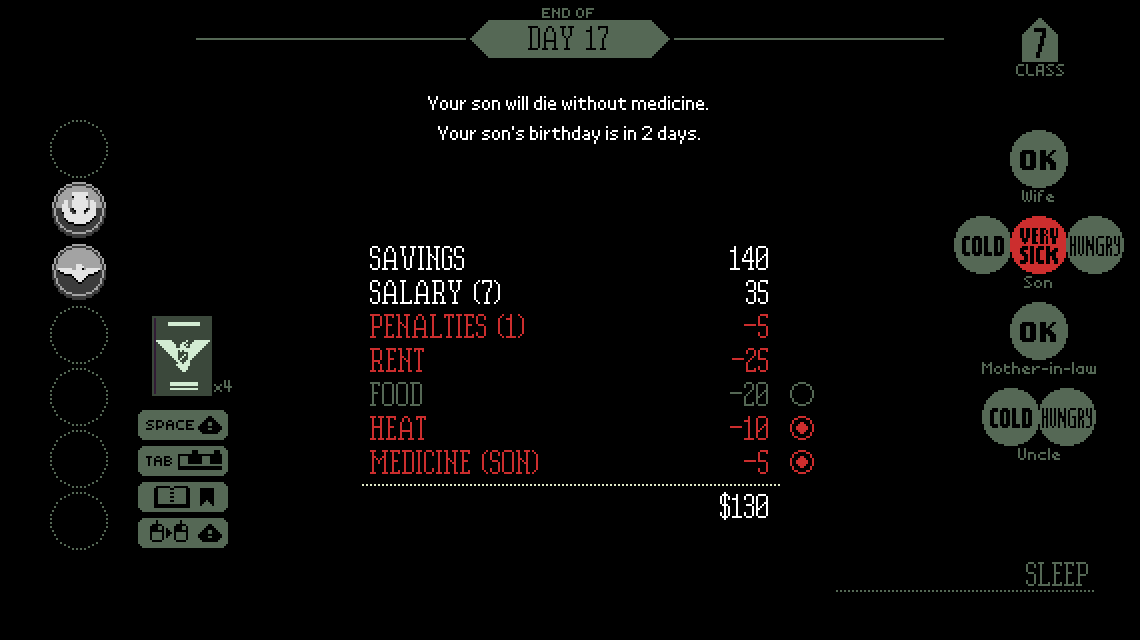
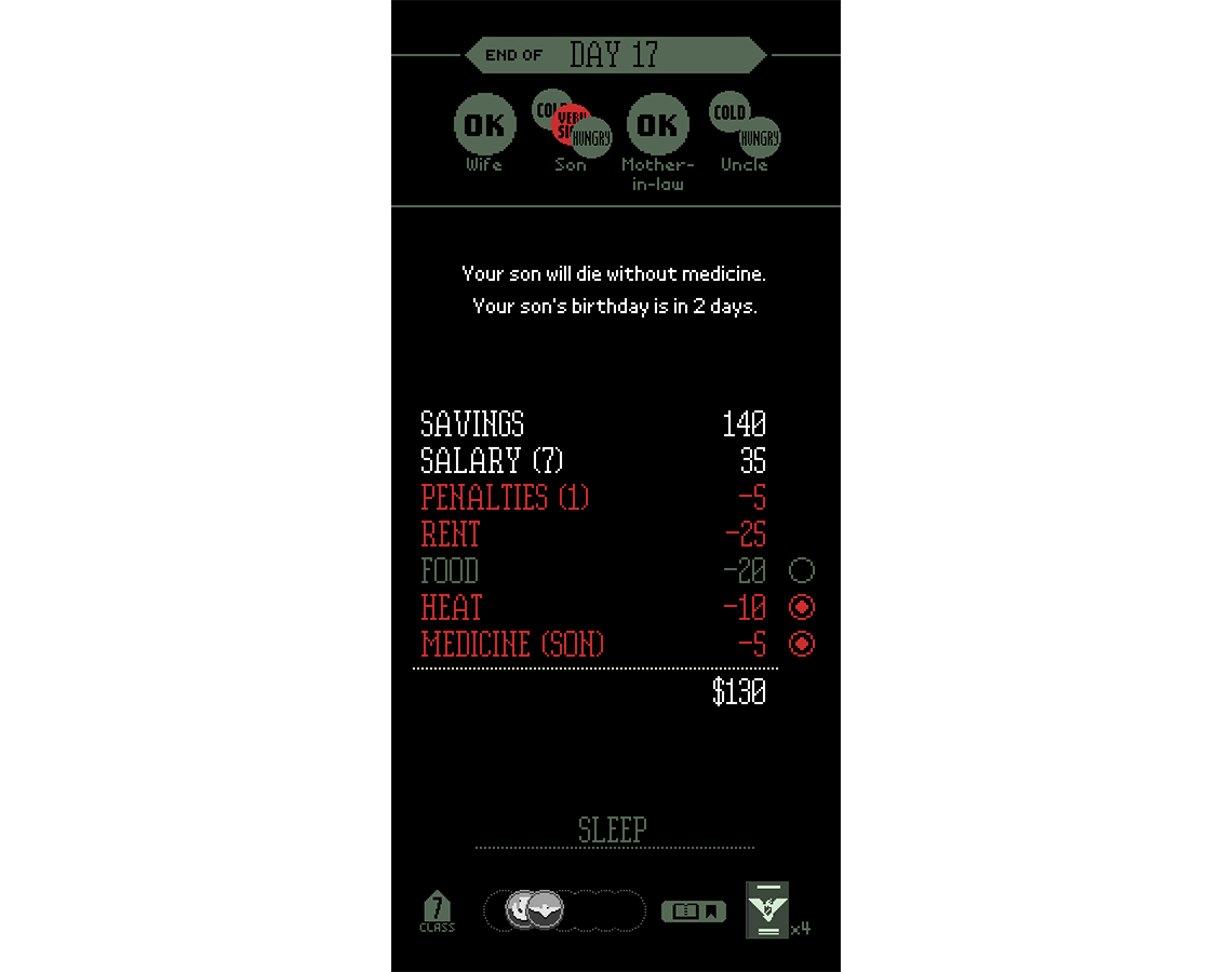
The night screen was a little more complex. It’s got way too much business going on, coasting easily in the desktop’s ocean of 570x320 but requiring a completely new layout and conditional 2/3 scaling to fit in 208x450.
The start-of-day newspaper was another big boy and needed both the 2/3 scale plus a narrower 3-column layout to replace the orignal 4-column layout:
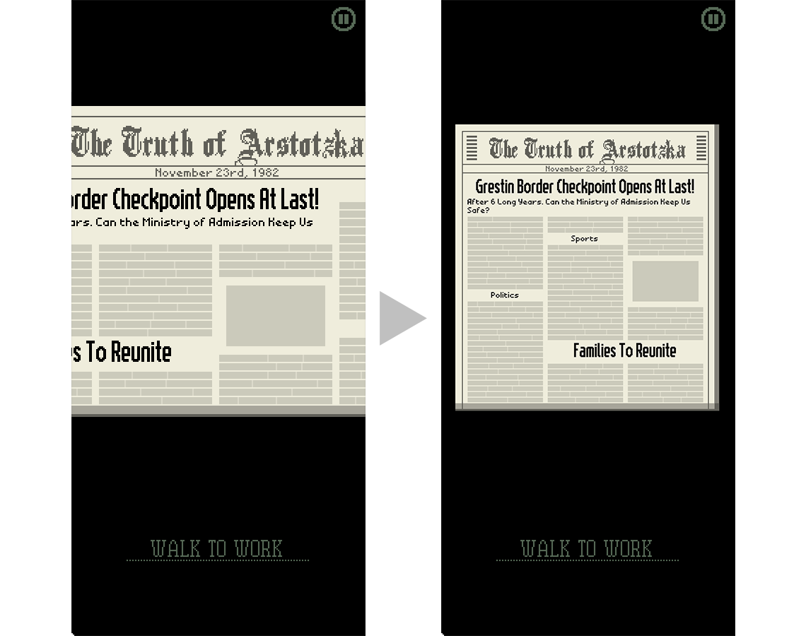
This “needs new background image” requirement for the newspaper segues to a core engine feature implemented for the port: load-time image transmogrification.
Image Transmogrification
Papers, Please has a boatload of documents and images that contain text. A good share of these are generated outside the game and have to be localized for each supported language. There’s tools to help with that but one of my goals for this port was to do as little localization work as possible.
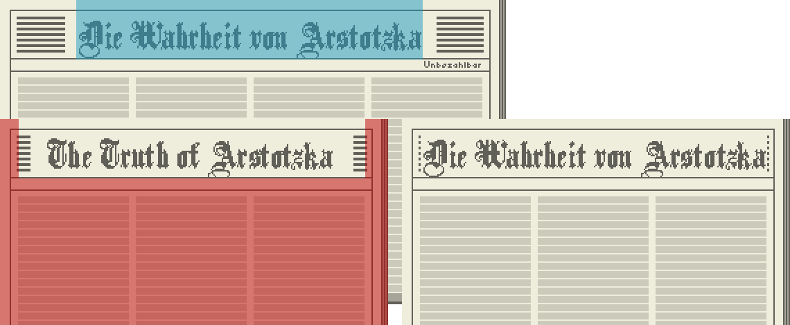
Instead of generating new images just for the phone layout, the game has a “mogrification” step when loading image assets that makes edits procedurally based on which platform it’s running. This is handled at a pretty low level so the higher level game logic doesn’t need to worry about it.
One example is the newspaper background, which has the localized name baked into the image. The mogrification process loads both the desktop-formatted localized image and the phone-formatted unlocalized image, then copies a section from one to the other to get a phone-formatted, localized image.
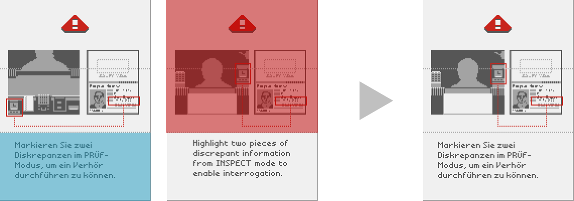
Another case is the bulletin page with inspection correlation instructions. Here, the mogrifier combines the localized lower half of this desktop-specific bulletin page with the unlocalized phone-specific upper half to get a localized phone-specific bulletin.
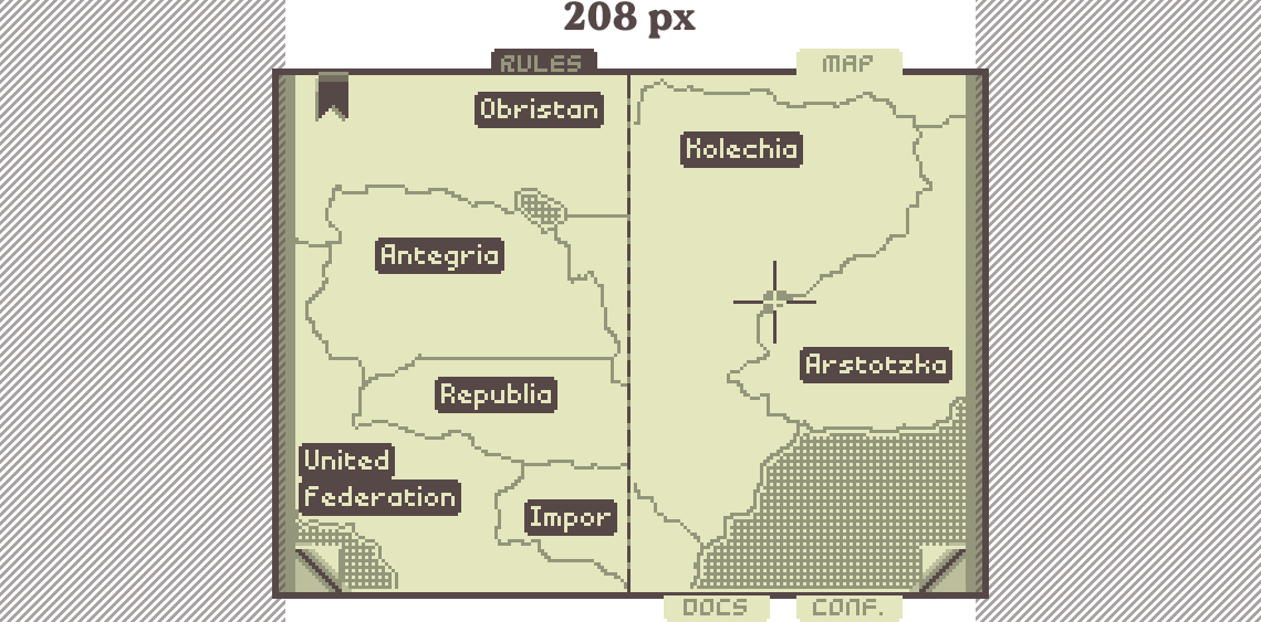
These load-time adjustments go beyond images and into some document layouts too. For example, the rulebook is the widest document in the game and it, horrifyingly, doesn’t fit in 208 pixels. It’s close but not quite, and there are important tabs and page-turn links on the edges that need to be comfortably onscreen.
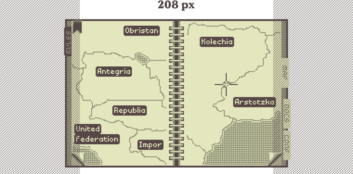
I wanted to keep the entire booth/documents area in one pixel grid, so 2/3 scaling wasn’t an option here.
Load-time mogrification works a number on this to crop each page, move all the active links, and rotate/re-position the tabs to fit within the 208 pixel width.
Hand Over Your Documents
In the desktop build, each traveler drops their documents on the countertop after they enter the booth. Plain and simple.
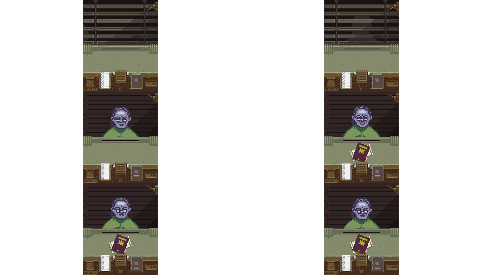
Due to the lack of space, the phone layout doesn’t have a functional countertop. An obvious alternative would be to have the docs just drop all the way down to the rack at the bottom and appear in the carousel automatically.
That seemed a bit passive to me though, losing the initial “ok fine I’ll take these” activity from the original desktop version when you drag them from the counter to the desk for reading. The solution I came up with is to float the documents first, requiring a tap to get them onto the rack and into the carousel. The order they’re tapped determines their order in the list.
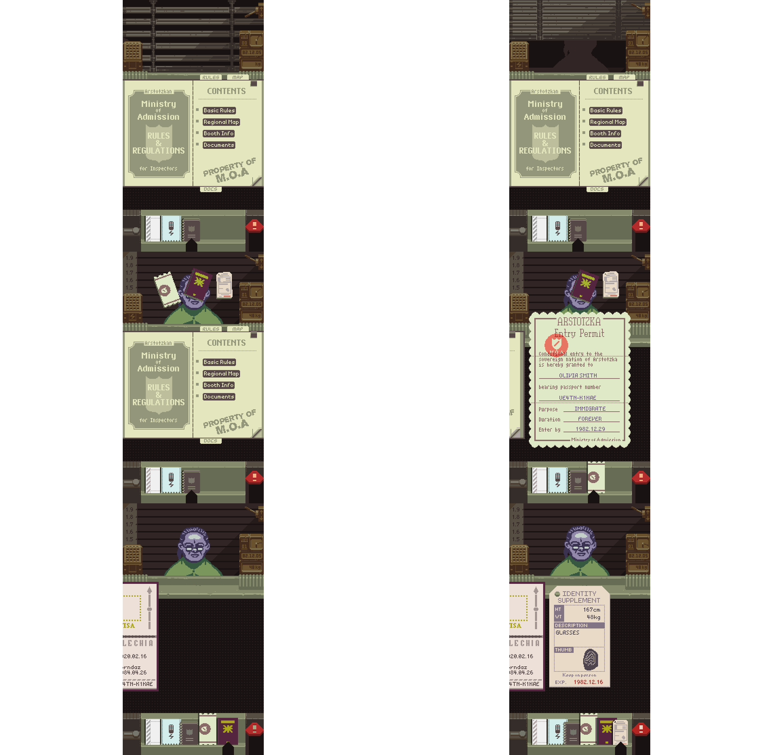
This design highlights something used throughout the phone version: overlapping elements. The main carousel is intended to feel like you’re holding documents up to scrutinize them, enhanced a bit by overlapping the traveler and booth console. To stay practical, it’s possible to pull the carousel down for a better look.
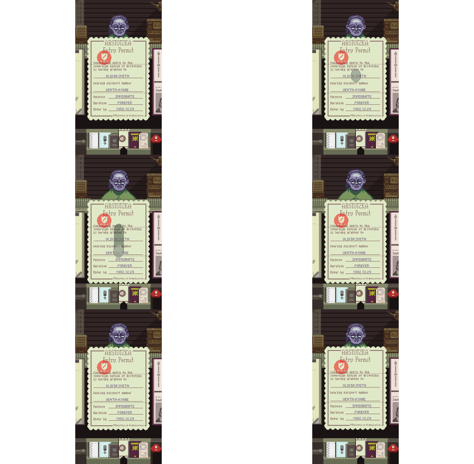
The original design of the booth was always pretty spacey but there are some distinct activity modes. For this port it was generally possible to optimize the use of space by masking/overlapping things that weren’t needed in one activity with something else needed right now.
Custom UI API OK
A notable benefit of writing my own UI system for this was that I could do some very specific things with touch and pointer input. Papers, Please looks like a pretty simple 2D game at a glance but representing all the document and interface interactions through standard input event callbacks in the original Haxe/OpenFL required a lot of uncomfortable hacks. The new input system doesn’t use callbacks and is cleaner now, which let me implement all the overlapping and passthrough input logic in a more manageable way.

Stamping
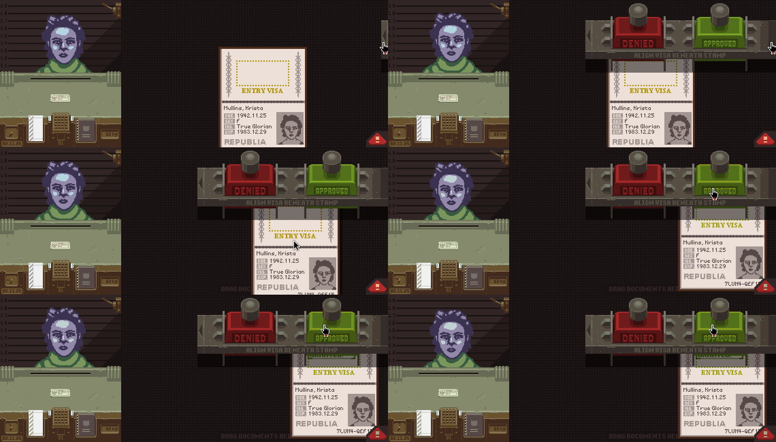
The desktop version has a stamp bar that slides out from the right side and hangs over the desk. To stamp a passport you just align it under the stamp and click.
I had some trouble redesigning this for the phone layout because (A) you can’t just drag the passport around to align it under the stamp, and (B) I didn’t want to give up the satisfaction of stamping on press/touch. Without this second requirement it’s simple to just make the stamp itself draggable, to be dropped on the passport where it automatically stamps. But then you’re stamping on release/un-touch, which never felt right to me. Some concepts I worked through:
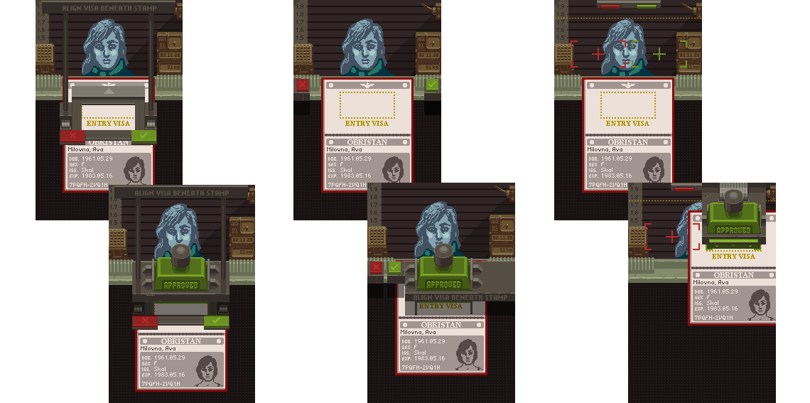
These all felt weird, confusing or just flat out didn’t work. There was something implicitly sensible with the desktop stamp bar that I wasn’t getting.
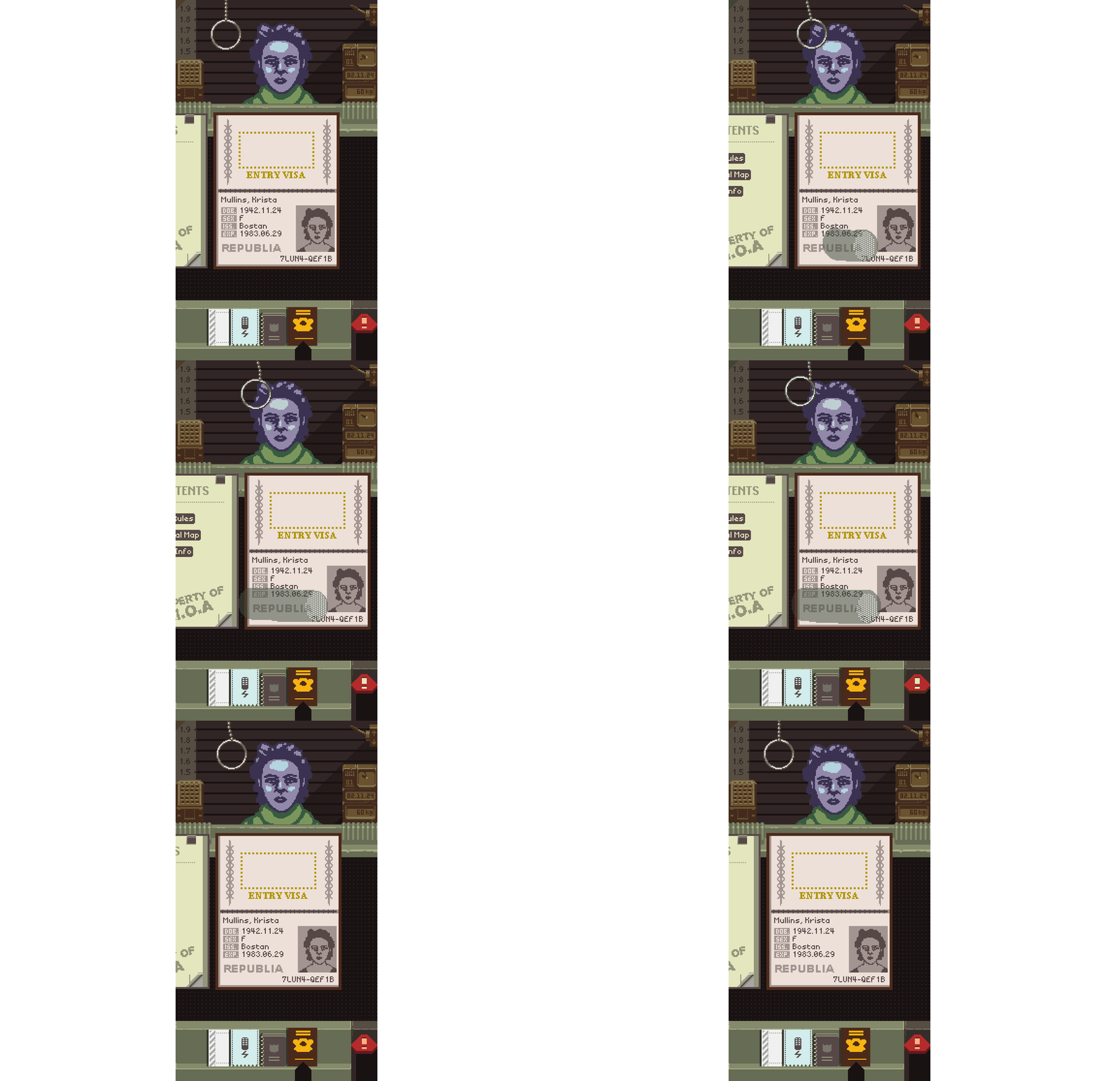
Ater some more experiments I decided to re-introduce the original setup, behind a modal switch. From the carousel, passports can isolate into a temporary stamp desk to be dragged around and stamped willy nilly.

This temporary stamp desk is opened with a pull chain, which allows me to save some screen space and helpfully indicate its availability only when a stampable document is focused. Also it’s marginally fun to play with the chain.
Key Desk Too, Sure Why Not
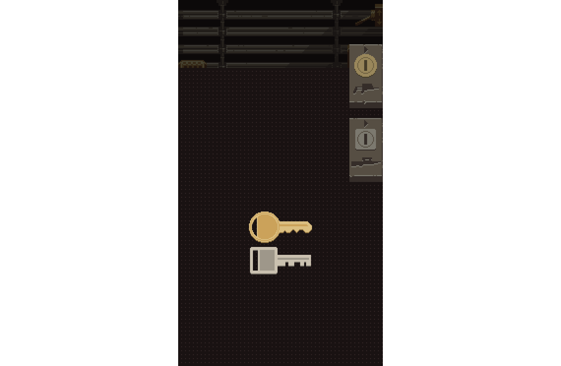
This same temporary-desk mechanic is used for the rifle and tranquilizer gun sequences. When a border attack is in progress, it quickly flips to the keys on an isolated desk. Dragging the keys and unlocking a gun works the same here as the desktop version.
Pincher
The need for a modal stamp/key desk was a gradual realization born from failed experimentation. In contrast, I knew from the start of this port that I’d need a way to let the player align certain documents on top of each other.
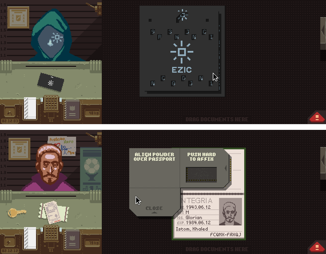
To replicate this functionality in the new carousel mobile design, I added an alligator-clip style pincher. Like with the stamp desk pullchain, this pincher appears only when certain documents are focused in the carousel.
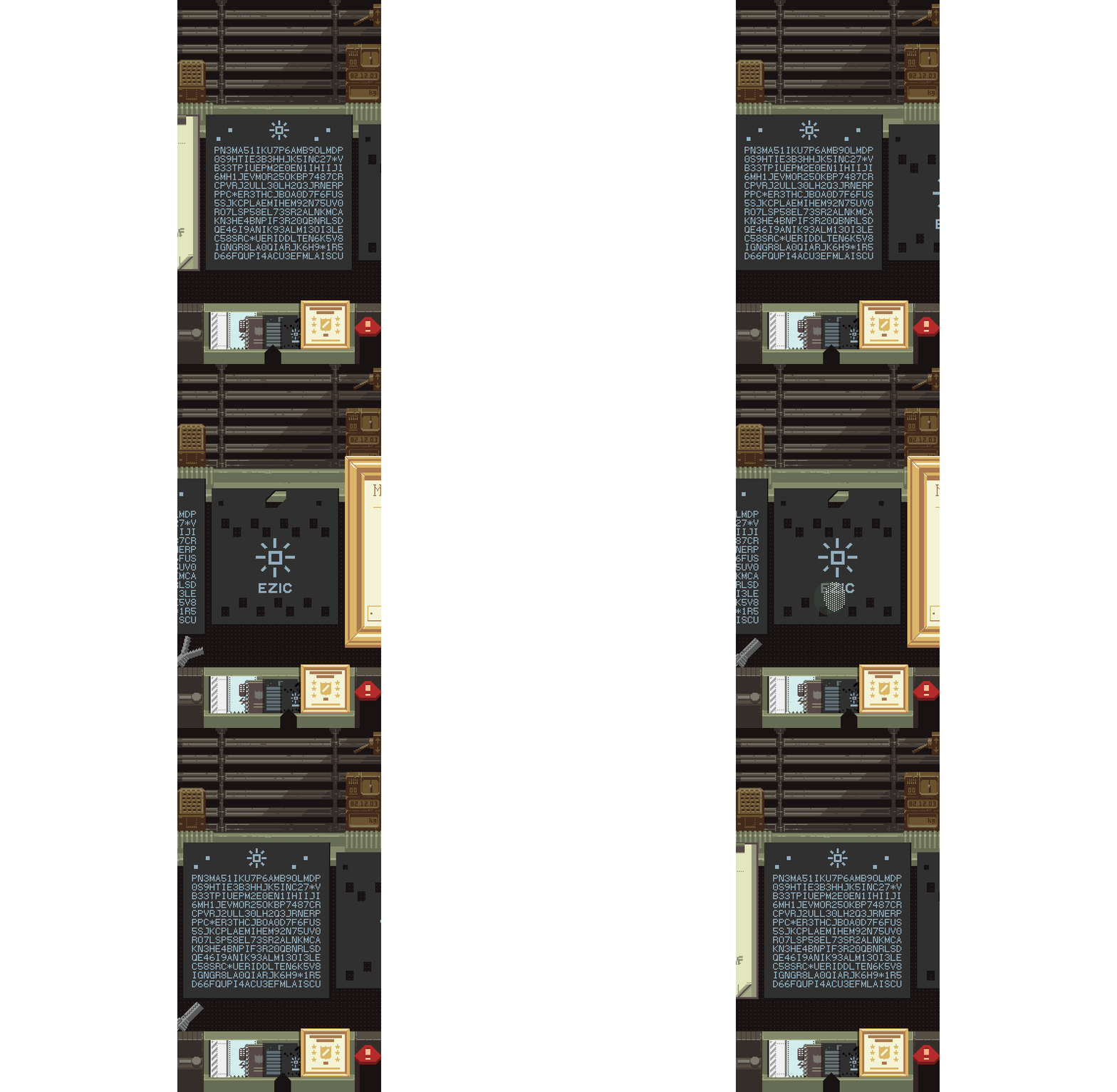
Tapping the pincher will grab the document and hold it above and out of the carousel, where it can be dragged around separately. The carousel remains scrollable underneath so things can be lined up.
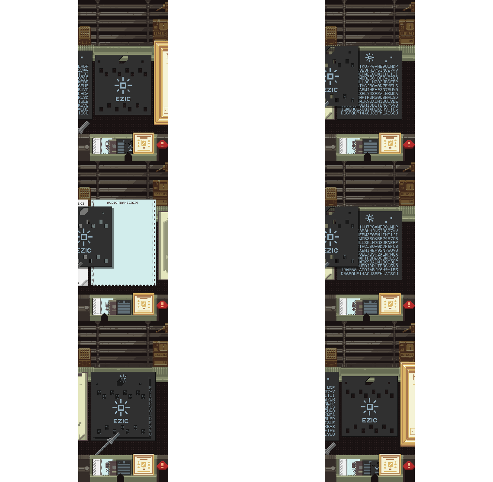
None of this is explained in-game so let’s assume the concept and mechanics are self-evident.
Wanted: Criminal Poster
One emergent play pattern in the desktop version is how to deal with the daily criminal bulletin.
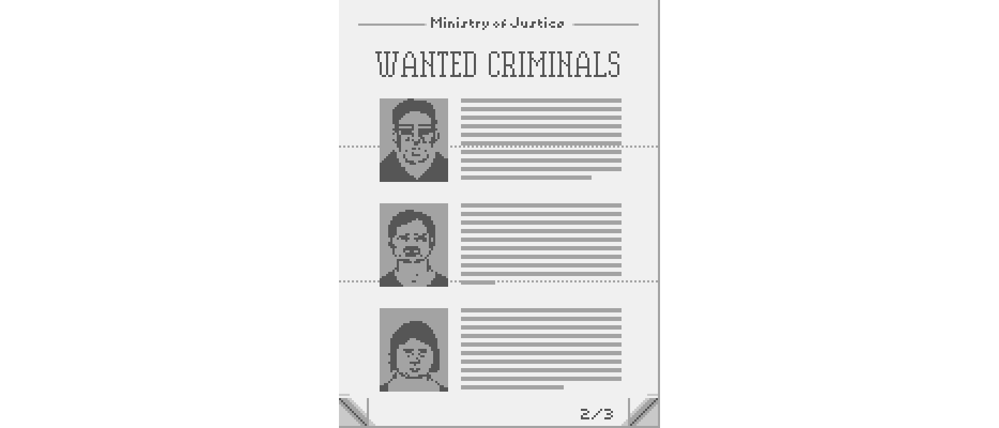
Any traveler matching a photo here needs to be interrogated, and the best way to keep this in mind while working is to tuck it off to the side of the desk and leave it there throughout the day.
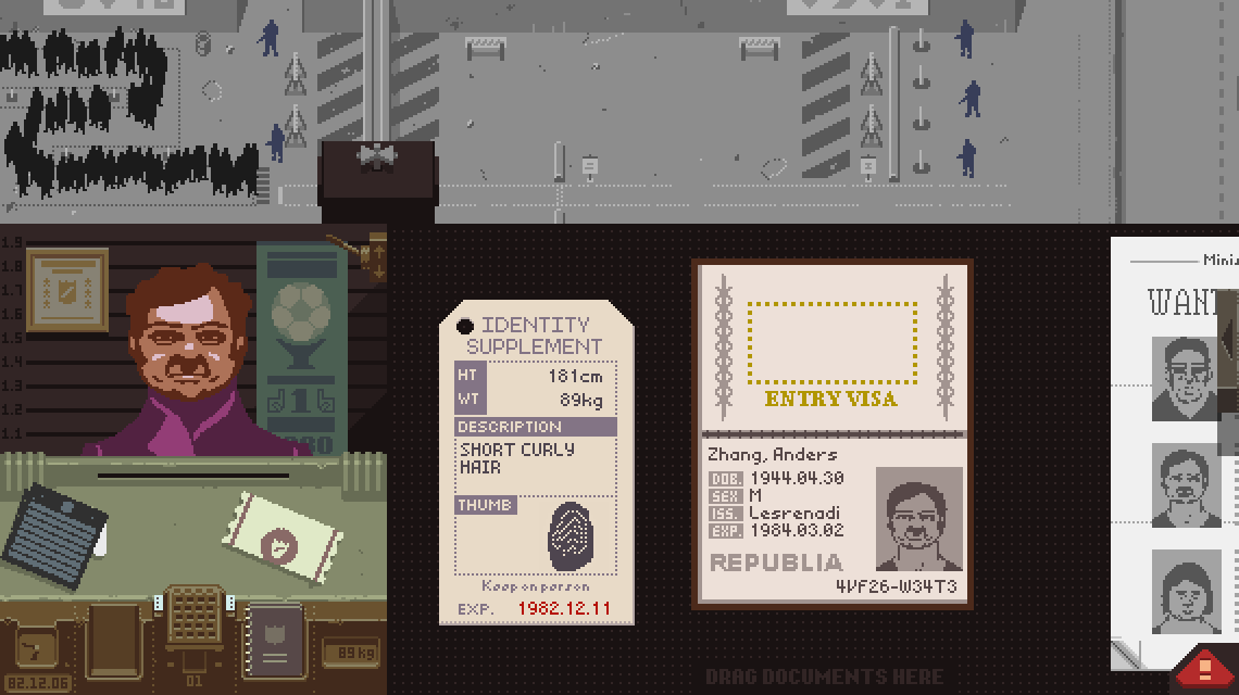
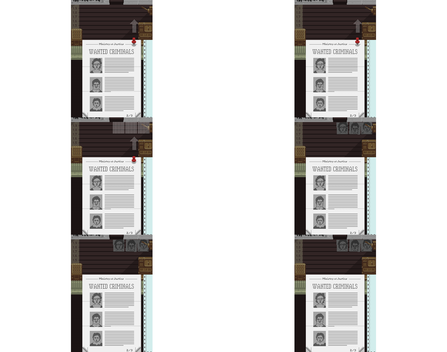
Since the freeform desk is gone in this new phone layout, it’s easy to swipe away from the bulletin and completely forget about the mugshots. This is a problem I didn’t catch until playing through the mostly-finished port, where I missed having a way to see those three faces at all times.
Space is so tight in the phone layout that there’s no perfect place to put them but I did find a little spot on the back wall where they can be hung up.

To preserve some of the desktop version’s intent, this isn’t automatic. The player needs to tap a pin in the bulletin to post them on the wall at the start of each day.
Action Buttons Don’t Fit
This could’ve gone under Doesn’t Fit. The desktop version’s FINGERPRINT, SEARCH, and DETAIN buttons don’t fit.

This was painful. These buttons drop down after an interrogation, and their appearance is a noisy eye-catching signal that the player has some new actions available. It’s rare, but possible, that all three are available at the same time.

With basically no place to put them and not wanting to scale them down I decided they couldn’t go in the main booth interface. There’s now an extra slide-out panel to hold them.

The panel pops out automatically when a new action becomes available, closes when clicking anywhere outside, and shows a flashing lever when hidden.
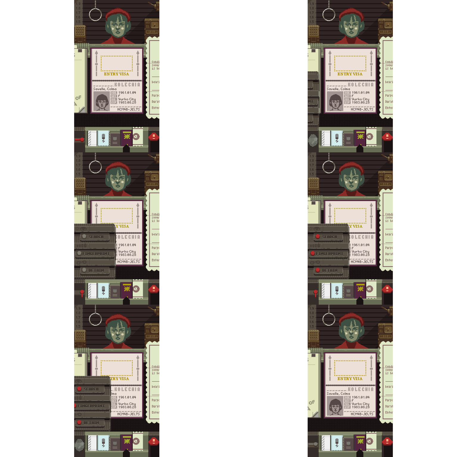
These buttons are fully localized as images, so reusing the same buttons and just putting them in a pop-out saves a bunch of trouble with the localization process.
Enhanced Inspect Mode
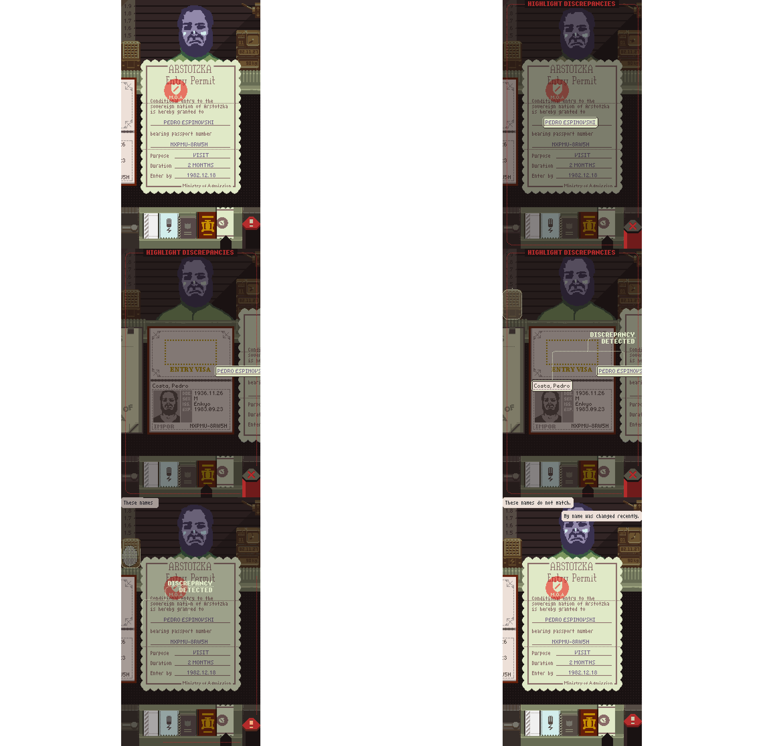
The original game treats its discrepancy-highlighting inspect mode as a quick aside. First the player arranges documents to get a clear view, then finds a discrepancy, enables inspect mode, highlights the problem, and finally interrogates. While inspect mode is active, documents can’t be moved and pages can’t be turned – things have to be in order before inspecting.
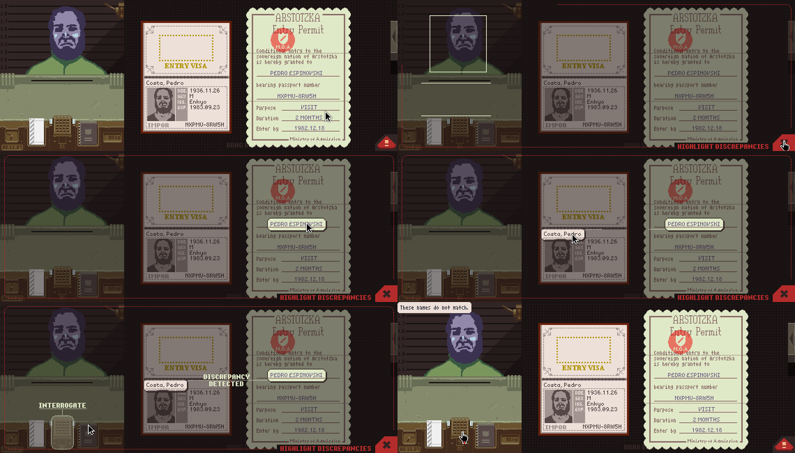
This process is impossible if you can’t see all your documents at once, as in the phone port. The fix was conceptually pretty simple but a fairly big technical pain in the ass: the carousel and page turn buttons are still active during inspect mode, and highlighted elements remain partially onscreen when their documents scroll away.
Polishing Tweaks
With all of the game’s interactions there was plenty of room for small frustrations. I did my best to fix these whenever I found them. None are critical but half the battle is just recognizing there’s some friction that could use smoothing, so I enjoy these kinds of tweaks.
Auto Sorting
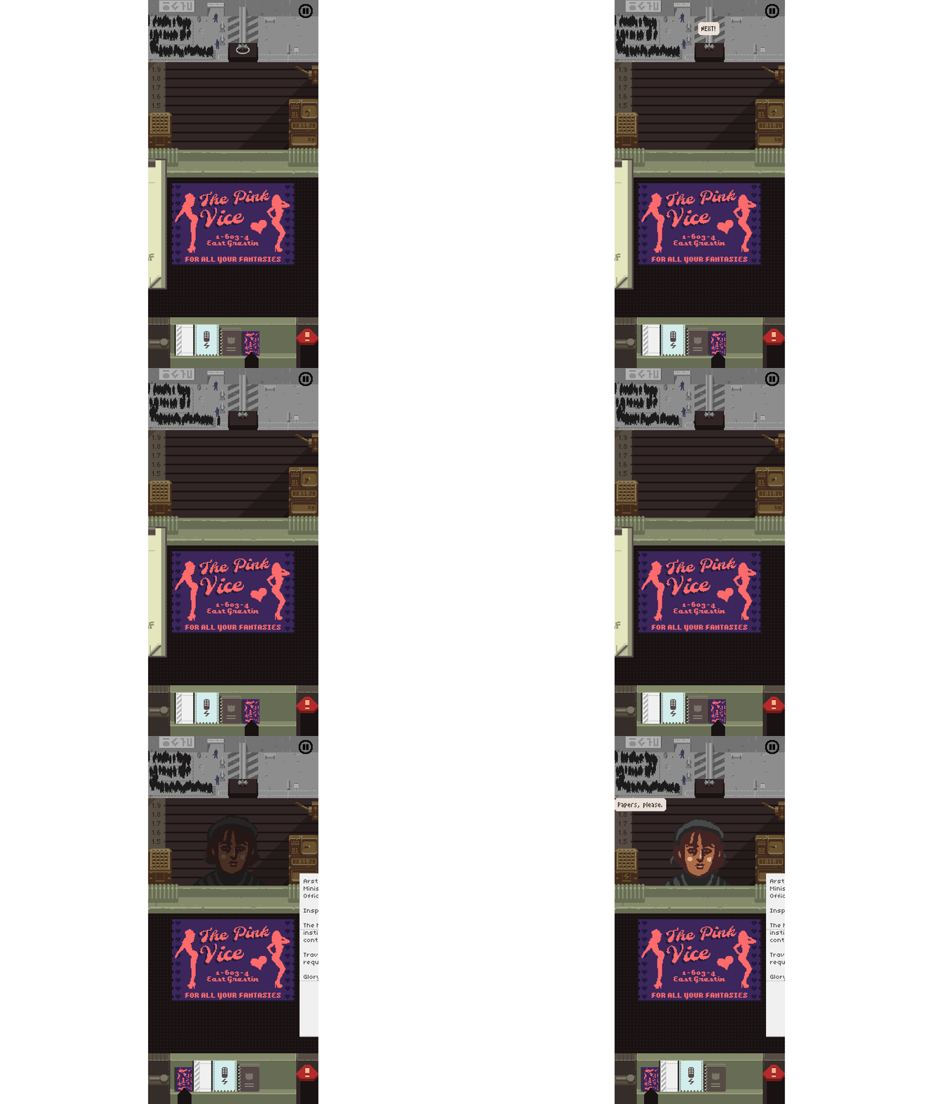
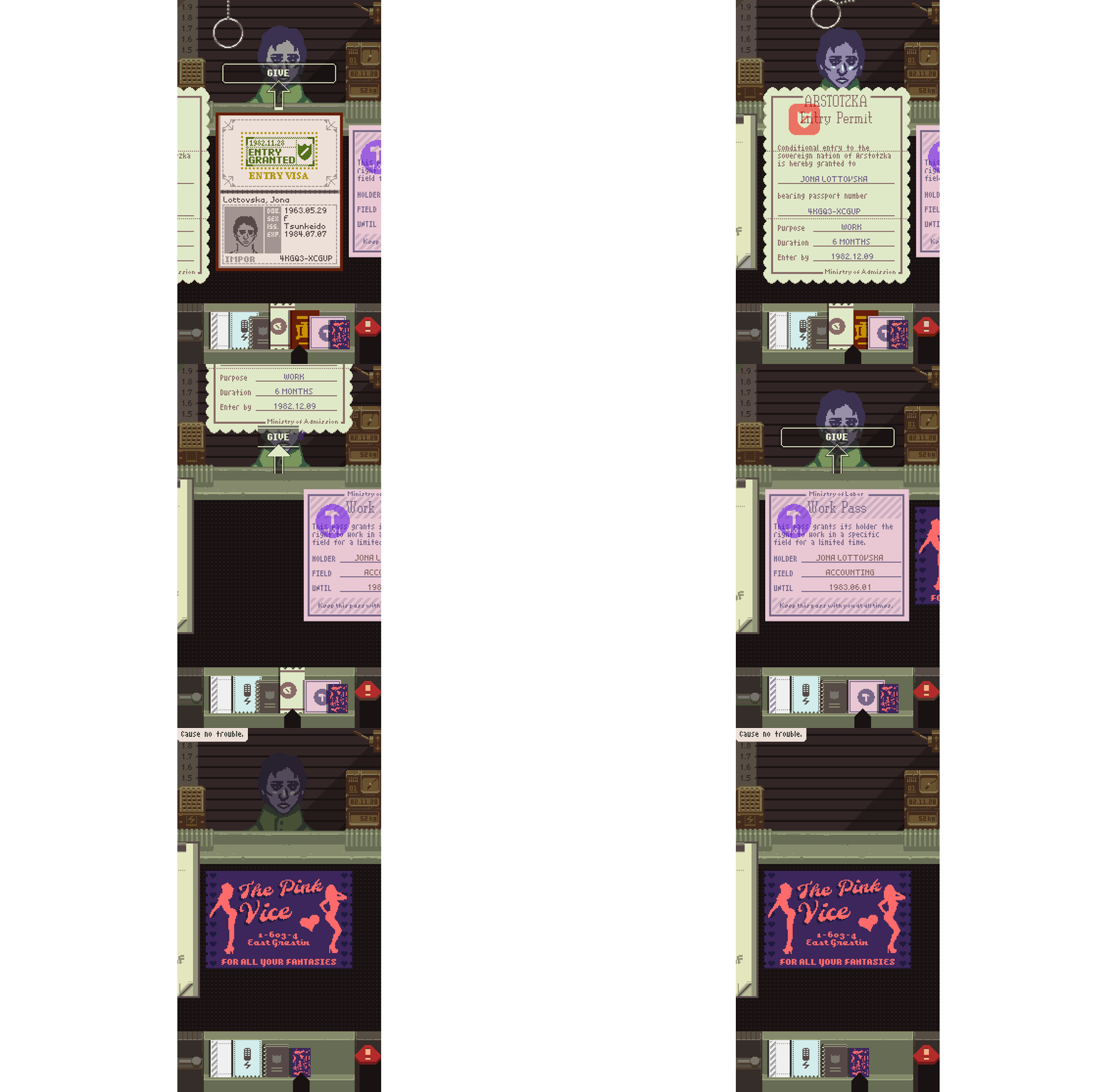
The three most important documents are the all-day ones: the bulletin, audio transcript, and rulebook. Because everything’s in a flat list now, it’s important to keep these three close to where each entrant’s new docs appear on the right. To do this, the game performs an instant re-sort when calling an entrant, without affecting the focused view.
Post-Give Smart Shift
Once a passport is stamped, the only thing left to do is give the entrant all their documents back. Giving a document back removes it from the carousel list, shifting the next document into view. My first implementation was the naive one: if document n disappears, shift to n-1. For a sequence of giving, this means it may shift to a document that’s not meant to be given back, requiring the player to manually swipe around. Not a huge deal but it’s a lot less annoying when the carousel intelligently shifts to the next givable one.
Peeking
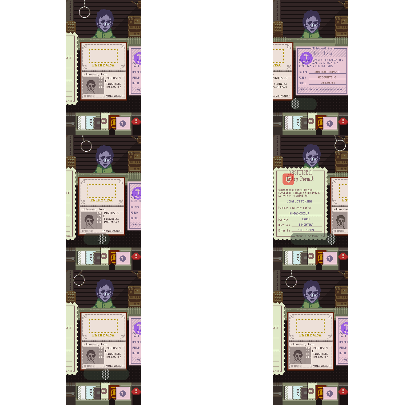
While looking for correlations and discrepancies there’s a lot of flipping back and forth. With swiping this is straightforward but if you keep your finger held on the screen and just slide it left and right, the reach isn’t enough to actually see whole documents on either side. Not immediately obvious but measurably frustrating while playing. My fix was to implement a “peek” feature that snaps the adjacent document fully into view when sliding just a little bit.
Auto Player Testing
The original desktop game has a debug “soak” test mode for stressing memory and gameplay logic. Basically, a process plays through the game by calling internal debug functions to load a day, stamp documents, shoot attackers, etc. This was useful for making sure there were no errant memory leaks or serious logic errors but because it called directly into high-level functions it wasn’t much use for testing the whole game and engine environment.
Having full control over the entire software stack for this port enabled me to enhance this system considerably. Instead of a memory soak test, it’s now a full automatic player that controls the game using the same input messages that a real player would.

The auto player is scriptable and follows “routes” to:
- Play through to all 20 endings, starting from the title screen.
- Earn all tokens.
- Play a few minutes of each Endless style and course.
- Seed each playthrough with a different random seed.
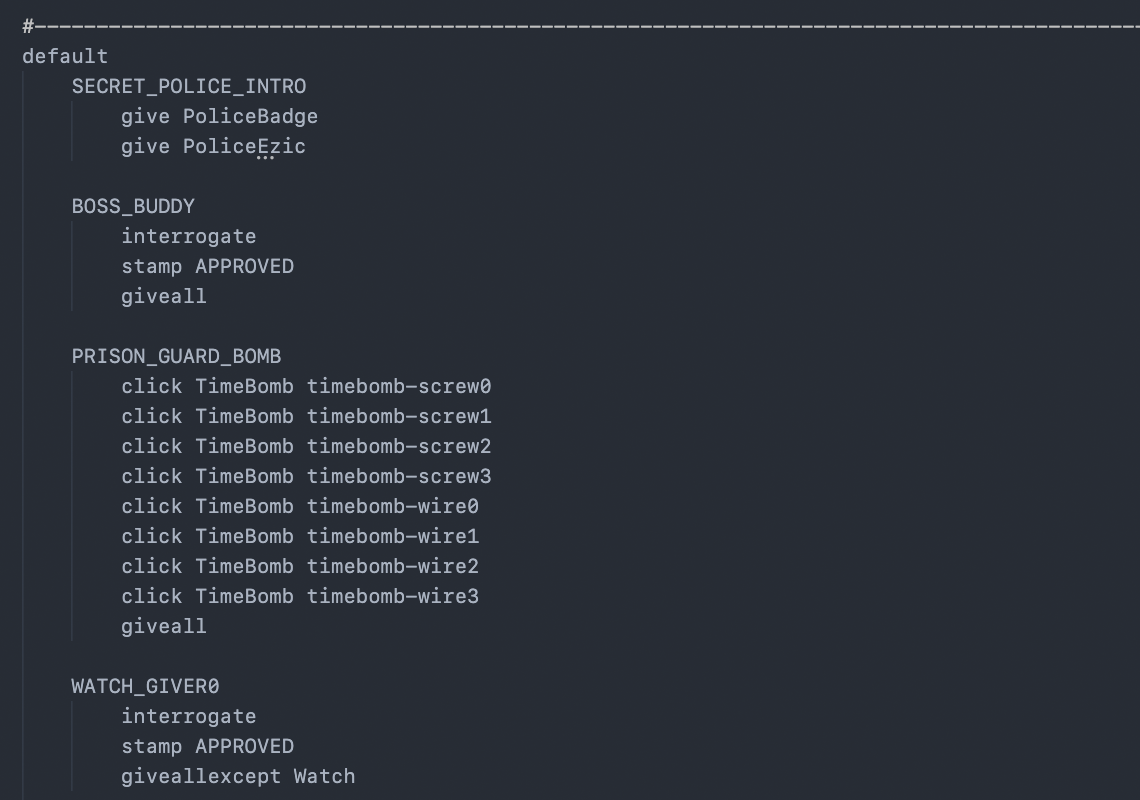
And because the entire rewritten game+engine is modular, it’s possible to run this auto player as fast as possible, with or without visuals. On a modern iPhone rendering every 1,000th frame, a full sweep through all ~30 routes takes about 15 minutes.
Creating this system was at least a solid month of initial work and a good amount of maintenance throughout. Quite a long time honestly but developing and using it has helped me find and fix countless bugs in the game. Since I develop on a Mac using Haxe/Heaps and deploy in Haxe/Unity, it’s also an invaluable way to verify that Heaps and Unity give the same result, and that Mac/iOS/Android all behave correctly. Smaller unit testing can validate some of this but nothing beats full playthroughs.
Platforms, Plural
There are now three core interface modes for the game: desktop, tablet, and phone. This port deals with just the mobile interfaces and supports phone and tablet layouts in the same app/binary.
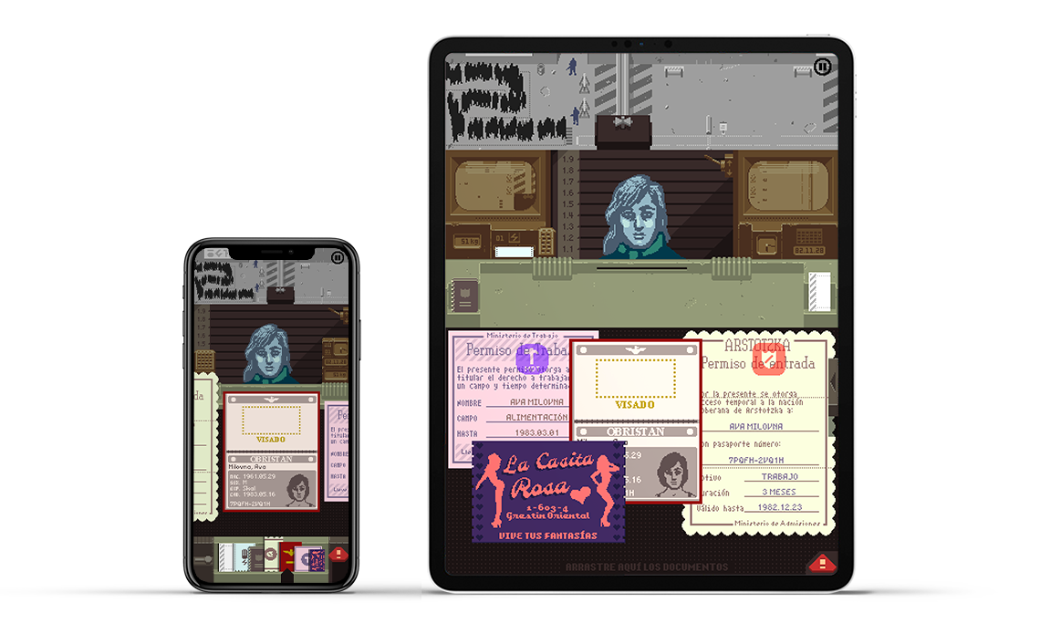
Since everything is in one binary, the game needs to know where it’s running in order to pick the right interface on startup. On iOS, this is easy as there’s an explicit check you can make for iPhone or iPad. On Android, surprisingly, there’s no clear delineation between phones and tablets and the game has to wing it based on resolution and DPI.
In the cases where it guesses wrong, there’s an added setting to explicitly choose which mode you want.
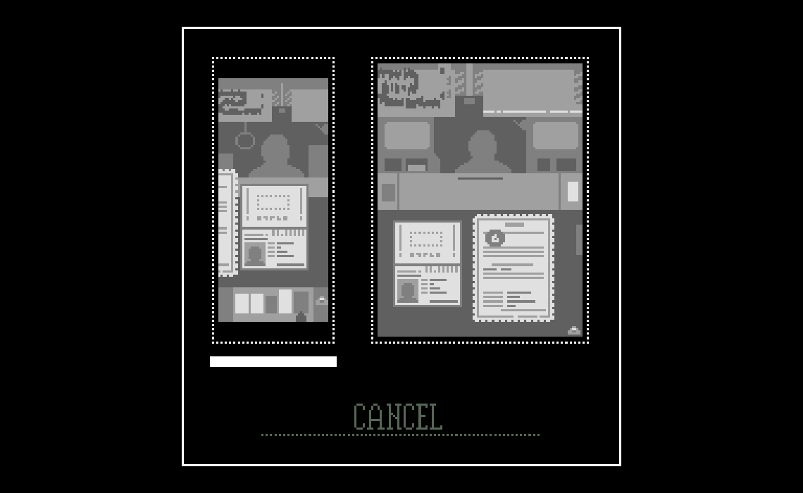
The final breakdown looks something like this:
- iPhone: phone layout only.
- iPad: default tablet layout, optional phone layout.
- Android Device: Optional phone and tablet layouts, default best guess.
Finally
A proper mobile version of Papers, Please has been a long time coming. Since the desktop release 9 years ago I’d dismissed the idea that the game could even work on phones but I guess a switch must’ve flipped in my head last year.
From start to finish this port took around 8 months of work. That sounds like an eternity but I enjoyed most of it so won’t complain too loudly. The sharpest cut is that it’s kept me away from working on anything else.
After putting out whatever fires light up after release I’ll take a short break and then get back to making new stuff. See you then.